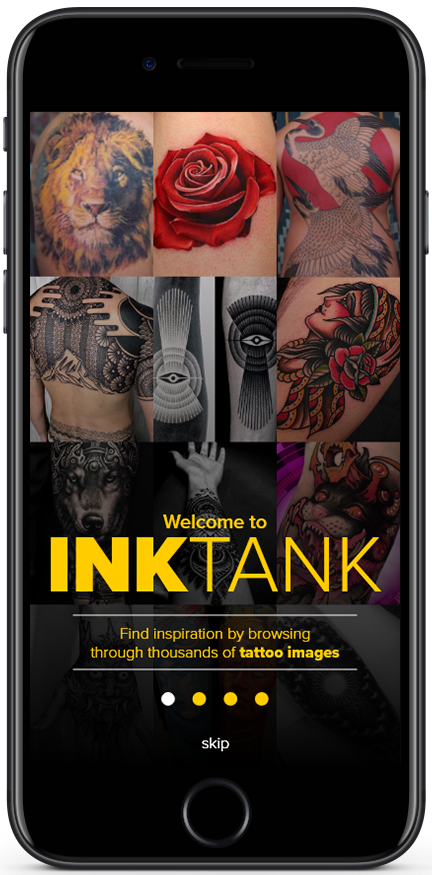
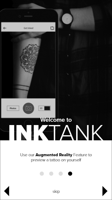
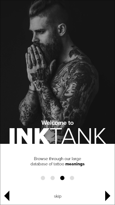
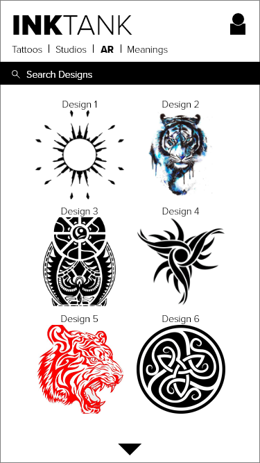
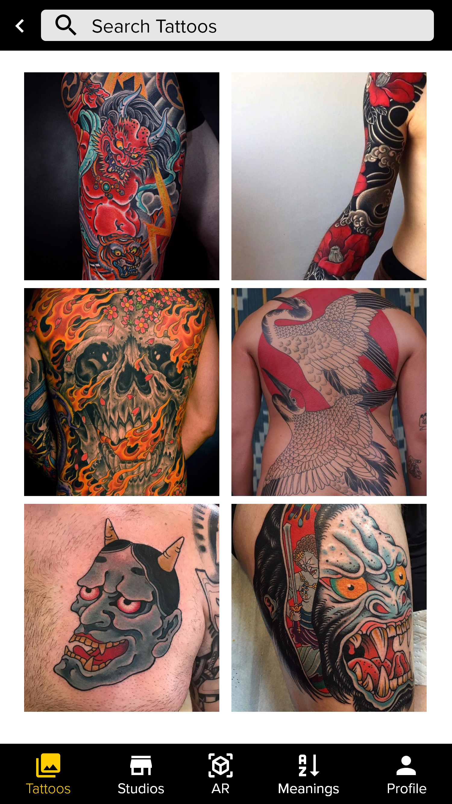
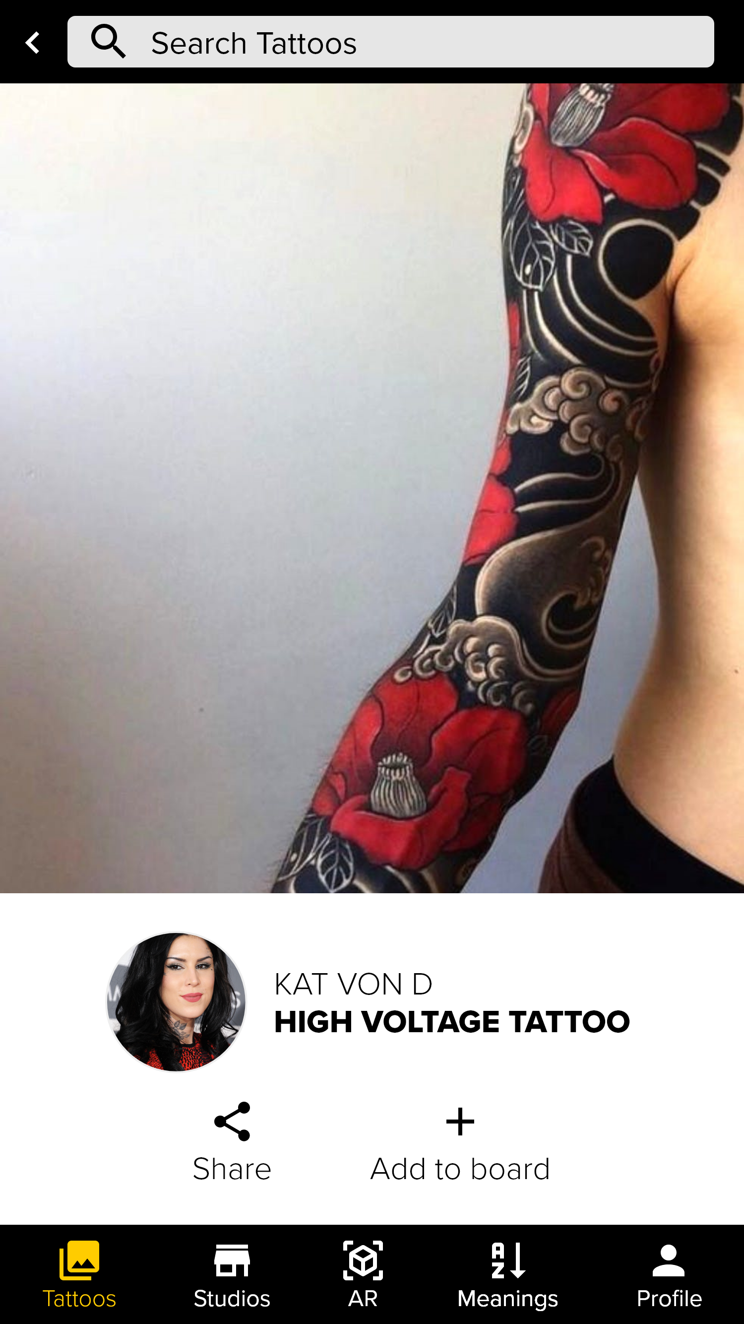
INKTANK is a tattoo app that is for anyone who is interested in tattoos. You can view and search through thousands of tattoos, find tattoo studios and book consultations, use an augmented reality feature which will allow you to preview how a tattoo will look on you, as well as look up tattoo meanings.
Design Thinking
I started by creating a plan to apply Design Thinking to this project, and to help better solve my design problems. I went through each step of the Design Thinking process, understand, observe, POV, ideate, prototype, test, tell story, present, pilot, and business model, and documented how I'd use it for this project. Click here to view the document.
Understanding the Problem
Next, I came up with possible problems, created a problem statement for the app, and brainstormed potential solutions.
Possible Problems:
Not knowing where to begin. Depending on where you live, there can be 100’s of tattoo shops and tattoo artists within a 30 mile radius. Where do you begin? What are the first steps you should take?
Conducting sufficient research to finding a great tattoo artist. Just because a person is a tattoo artist does not mean they are great at their job. Finding thorough reviews about a tattoo shop and tattoo artist, along with examples of there work would be a necessary feature.
Inspiration to help find an amazing tattoo.
Finding a specialist in a certain style of tattoos that you may want. It could be you want a black and white tattoo, portrait, bio-mech, 3d, hyper-realistic tattoo, or even a cover up.
Regretting the tattoo. This could be for a variety of reasons
Maybe you want to test out the tattoo before committing to it. Augmented reality or a function to where you can purchase a temporary tattoo off the app would help.
Problem Statement
Tattoo’s have become mainstream in recent years and more and more people are getting them. The process can be overwhelming and stressful as a person might not know exactly what kind of tattoo they want, or where to go to get the best quality work done. With 17% of tattooed people partially regretting a tattoo they have, it is important to help solve these problems.
Problem Solution
Ink Tank will have features that will solve these problems by having a variety of filters. You would be able to search by radius, reviews, specialties, and have a links to the shop/artists website where their work can be viewed. You will also be able to create a portfolio folder of art and tattoos you like for inspiration, use an augmented reality feature to see a tattoo through your camera on yourself, and have the option to order a custom temporary tattoo. These features will assist you in finding the right tattoo for you as the best tattoo artist to help get the job done.
Competitive Analysis
I researched and analyzed two tattoo apps called Tattoodo and InkHunter. I chose these two because they were at the top of the list of apps when I searched “tattoo” in Google Play. These apps are competitors in the field of helping a person discover a tattoo they would like to get as well as finding a tattoo shop and artist. By analyzing the pros and cons of these apps, I gained a greater understanding of how to create my app.
Lean UX vs. Agile UX
I compared Lean UX vs. Agile UX and choose Lean UX as a method to use for this app. Lean UX shines when you don’t 100% know what it is you are building, allows you to make assumptions, and allows you to cut down on requirement documents. At this stage I didn’t have the app totally mapped out and this methodology allowed me develop it as I went along. If I had a concrete vision in my mind or was working with a team Agile would have been the way to go. But since I wasn’t on a team, I went with Lean UX, where I built, measured, and learned.
I then chose two product features and wrote a hypothesis for each feature to test using the build-measure-learn cycle, and described what I would do in each phase of the cycle. Click here to view the document.
Business Requirements
I then created a Business Requirements Document for the app to serve as an example and used it as inspiration and a stepping stone. It includes an executive summary, S.M.A.R.T business objectives, scope, functional requirements, and a delivery schedule. Click here to view this document.
User Stories
After doing creating the Business Requirements, I created User Stories to help brainstorm what features INKTANK would have, explain specific actions a user could take within my app, and to distill the features down to small, readable and executable parts. I have listed a few of them below. Click here to read all of them.
Sign up/Log in
As a user, I need to be able to sign up and log in so all of my account information will be saved.
Admin Area
As a user, I expect there to be an admin area where I can edit my personal information so the app will be personal to me.
Home page
As a user, I would like to see categories of tattoos on the home page so I can scroll through them with ease and look at tattoos of a specific style.
Search bar
As a user, I would like a way to search for tattoo artists near me by city, state, and or zip code, so I can see what my options are in my area.
Surveys & Interviews
I interviewed friends and family who had tattoos to figure out how they decide to get a tattoo, including the imagery itself, and how they go about choosing a tattoo artist, to discover any pain points they might encounter in the process, and to discover what they would want out of an app to help them in the process of getting a tattoo.
Personas
Once I analyzed the data from the surveys & interviews I conducted, I created User Personas to represent the target audience for InkTank to help me better construct the app. Click on the profile images below to view the personas.
User Journeys
After creating personas, I created a few user journey maps to help visualize the processes a user goes through in order to accomplish a goal. Journey maps are narrative documents and when you can tell a memorable story about a user’s goals, the entire product team will be able to enjoy a focused, shared vision as they progress through the design process. Click the image below to view the journey maps.
User Flows
I then created user flows to help make my design more user-centered, so it would be successful from my users’ point of view.
Sitemap
To illustrate the information architecture, which refers to how pages are laid out, connected, and given different levels of hierarchy, I created a Sitemap. The Sitemap is an organizational map which outlines the hierarchy of the app. It's different from user flows because it only focuses on the page hierarchy rather than the specific actions the user takes to traverse the application.
Wireframes
The next step in the process of making this app was to create wireframes. I started off sketching low fidelity wire frames to get an idea of how the app should be, then created mid fidelity prototypes to bring the app to the next level.
The next step was to design the high fidelity wireframes. For the onboarding screens, I used images which would help to tell the story of what the app does. Below is the first version of high fidelity wireframes. Click on one of the thumbnails below to view the full size images.
Usability Testing
After I had completed the first draft of the high fidelity prototype, I conducted six in-person usability test sessions for InkTank between 02/03/2018 and 02/04/2018 and used an app called Mobizen to record the audio and screen.
Test Objectives
Determine if the tasks I ask them to accomplish will be able to be done easily and intuitively. This includes logging in, sharing a tattoo image, booking a consultation with a tattoo studio, using the AR Feature, and finding a tattoo meaning.
Discover any possible pain points and errors within the app. I will ask them as well as observe their body language and facial expressions while they use the app.
Get general feedback of the app and how the participants feel about it, what they like about the app, and what areas of the app they think can be improved.
Methodology
I conducted 6 moderated in-person tests and was able to view their body language and facial expressions as well as receive valuable feedback from the participants.
Test Results
I received valuable feedback from the tests I conducted and used that feedback to polish the function and design of the app.
Design Language
Before redesigning the high fidelity screens, I created a Design Language which is a set of overarching rules and standards that help maintain consistency in design. This includes color, typography, iconography, common UI components, grid/layout, interactions, animations, tone of voice, accessibility guidelines, and design resources.
Final Mockups
Below are the screens of the final mockups. I redesigned the onboarding and login screens as well as a variety of other changes to make the app more functional and visually appealing. Click on one of the thumbnails below to view the full size images.
Try out the prototype!
https://xd.adobe.com/view/16b18ff1-7e4e-433e-bd4b-c69adf974b1c-43e2/
Below is a video presentation of the prototype.
